Introduction
Web content management systems, such as WordPress, or Drupal, don’t aim for controlling your content. They control web pages. In other words, they are ”template management systems” used primarily (and in most cases solely) for web page management.
Content, in its turn, comes in various forms: this can be a blog post, a collection of data in the format of spreadsheets, a video, infographics, etc. Content can be almost anything, while many existing CMS platforms are so focused on making content creators live for the system they created for you.
Templates are a prime example of that. They are rigid, hard to move, inflexible. That makes your content very limited in terms of creativity if nothing else
They are rigid in behavior, making editing pages to do specific things difficult. It’s hard to move parts of a template around, and it stands in the way of developing free forms of the content.
If you’re considering building a new website—or perhaps you’re just looking to make your existing one a little more user-friendly — you may have come across a few keywords that describe approaches to modern web design. Atomic design, or modular design as it’s often called, has revolutionized the way we build websites.
It has introduced a new level of flexibility into the design process while putting content control into the hands of website owners.
In this article, we’ll speak of the differences between templates and modules in modern design, benefits modular design proposes, and challenges it has to overcome. We will also explore the technology requirements modular web design possesses and discuss the:
Difference Between Templates and Modules
Going modular means making It also means composed of standardized units, or interchangeable. The modular design traces much of its lineage back to print-based concepts.
The newspaper—the kind we once held but prefer to scroll through today—is a great example. Savvy print designers pioneered the use of content blocks, designating each component a story would have: the header, text columns, images with captions, etc.
Having a go-to template is just the kind of thing you need when putting out a daily publication. Time, after all, will always be of the essence.
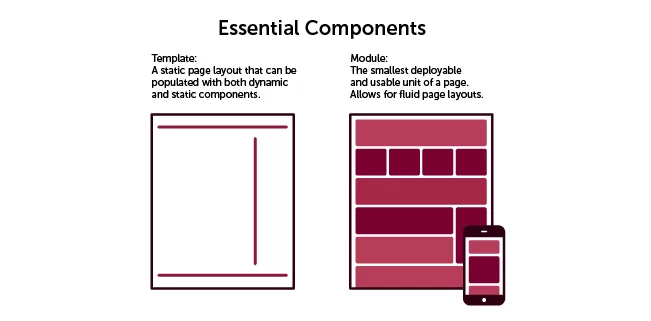
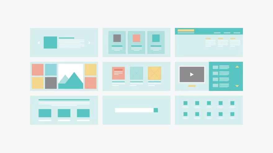
The image shows a basic modular page setup, with components that can be added or taken away based on the given page.
At the same time, modules possess the following traits: flexible, design approach, they follow both a vertical and horizontal flow, create interchangeable content blocks for customization, and less restrictive than templates.
Source: briteweb.com
Benefits of Going Modular
- Quicker Development And Deployment
A modular site that, for instance, has 5 modules that can be launched and have hundreds of page possibilities!! This means you can launch a site as a minimum viable product and still have a measure of uniqueness that a template-driven site can’t achieve.
In the past, a quick-launch site may have 2 or 3 templates. It was easy for a user to notice this and at a subconscious level make a judgment as to the time and effort put into the site. Now, you can go to market extremely quickly and iterate the site by adding new modules as necessary, as part of an ongoing continuous improvement plan.
Modular design gives more latitude to these individuals and more freedom to position and applies the concepts they want to communicate.
Easier in Terms of Micro Targeted Redesigns Realizations
Let’s say in the past you wanted to have a new landing page put together. You may talk to a designer, who would work to assemble a mockup. You’d then engage in a convoluted series of approvals and meetings to discuss the design. By about revision 10, you are probably losing any level of enthusiasm for the entire campaign.
Source: hatchedlondon.com
With modular web design, you can effectively cut the designer out of the process. You can assemble a live mockup of your landing page, based on parts that already exist. The page can then be distributed to team members via the actual, final URL.
As you may have already guessed, people are less likely to give overall design feedback when presented with a functional URL. Mostly because people want to be heard and want to give feedback, but recognize that in this late stage massive changes probably aren’t likely to happen.
- Gives More Control to Web Editors
Modular web design starts at design. The CMS must be flexible enough to handle it. A developer isn’t qualified to create modules based on a template and understand what a marketer does and doesn’t need to accomplish
If printed onto physical paper, a website can be cut into modules. Usually, it will be such pieces as op navigation, a hero image, a content block. Maybe a module of 3 blocks or 2 blocks.
A designer should be able to build new pages by taking those pieces and re-assembling them. Basically, this is the vel of control you will have when your site is modularly designed and integrated into a capable content management system.
- Easier To Maintain And Amend
Templates are a bloated concept. They have a large number of dependencies between themselves. Modules are flexible and adaptable. An entire webpage is a set of modules from top navigation down to the footer navigation.
This means you’ll never have to worry again, with this methodology, about doing complex, convoluted website redesigns. We’ve already spoken about the current way websites are designed. You go through a three to a six-month process of redesign, then the site sits for 2 years until the process repeats itself. Typically, each time you’ll reinstall your CMS platform and porting content will be such a pain that you may just rewrite it.
Can you imagine if your next redesign didn’t happen in two years, but happened on an ongoing basis?
That is another key benefit of this approach. Because modules are so independent of each other, redesigns are much faster. Top and bottom navigation modules can change easily. Therefore, your next redesign isn’t going to be bogged down in template design (more on this later).
Instead, you can change parts as you see fit on an ongoing basis to see what works or doesn’t work from an analytics perspective. With this new methodology, it is potentially the case that your next redesign and rebuild could be your last for a very long time, breaking the 2-year cycle.
- It’s Cheaper To Build And Maintain
Modular web design again focuses on parts. Designers have to work on the design of parts, and the client can imagine the range of possibilities. We already talked about how buy-in is easier from management. But, a side effect of that is that fewer revisions are needed and fewer functional template mockups are necessary. That results in less time spent, which results in lower budget requirements.
Also, consider maintenance. We’ll talk more about this later, but with a template-driven site, you are going to have many instances where a new template will be required. This means, design and development costs, in addition to accumulating technical debt.
Challenges of the Free-Form Design
Alongside with the quite significant list of benefits, there are also challenges on the way of free-form design deployment. Dennis Kardys, director of design & production at Diagram, web designer with 12 years of experience, highlights the following challenges of the free form design:

Source: abdulvasi.me
- Formatting that’s based on individual discretion rather than content structure leads to the inconsistent application of styles.
- The style that’s applied to elements within the content, rather than controlled globally, convolutes your content with inline HTML and CSS code. This creates a mess with the ways content being reused across the site, and how it is rendered across different screen sizes, or how it can be adapted in the future.
- As the number of pages with custom layouts increases, the design appears more haphazard. This negatively impacts the user’s navigational flow and can create needless confusion.
So, the inconsistency of app styles, reusability issues across the website and some sort of confusion as the number of web pages grows is a small price for all these benefits listed above.
Technology Requirements
This is a huge topic that goes beyond the scope of this initial blog post. To have a modular website work, you need a suiting content management system: a system that allows managing the content, not web pages.
CMS platforms should return to their initial state: become systems to manage “content”, not the “presentations” of the content, such as websites. The most popular systems available today, from open-source to enterprise, all focus heavily on content from the perspective of web pages.
Content is changing. The most famous CMSs, like WordPress, Drupal, or Joomla are all obsessed with integrated display focused on the Web.
A customized, headless CMS solution might be the option for the future: such systems allow for content managers to manage the content in an organized fashion and then publish to multiple mediums. If your only medium right now is the Web, you can expand it to other formats, rather than focusing on a standalone option
Best of all, with the extended lifespan of modular web design, and the already-proven lifespan of headless CMS systems, this may be your option for the next 5 or even 10 years.
Successful Examples of Modular Design
It is hard to give an example of a website with the modular design without being accused of advertising this or that trademark.
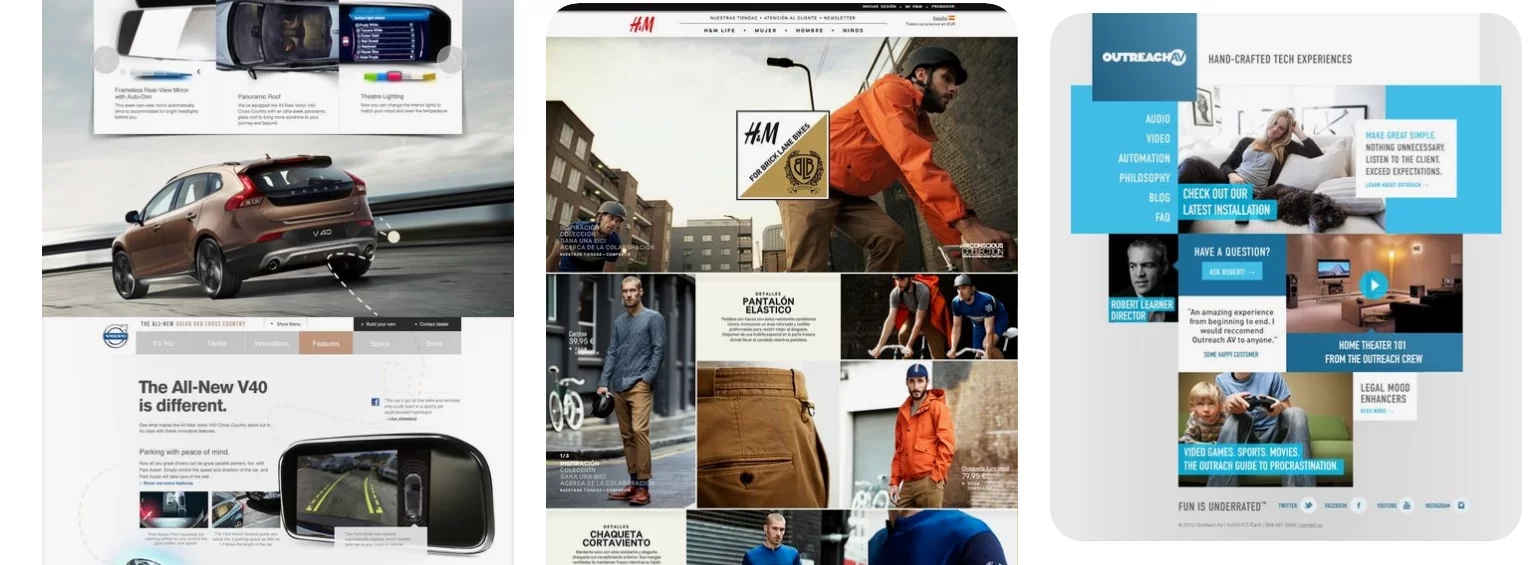
Indeed, it is not that difficult to find user-friendly commercial or marketing websites out there. We’ve decided to have a rade to some Pinterest modular web design.
Source: pinterest.co.uk
If you are browsing a lot on retail or marketing websites, you see modular web design examples very often.
Outro
In modular web design the focus of effort of working at your website shifts away from agonizing over a handful of individual pages (at the expense of all the others) and toward a smart system of reusable design patterns, interchangeable components, and well-planned system logic.
This leads to a more scalable infrastructure, better adherence to design standards, and content authors who are empowered to worry less about pushing pixels and focus on their core expertise: creating better pieces of content and boosting sales through your website.
If you are interested in design and website building issues, read our previous article – The Current State of Machine Learning in Design
